
Dynamic Charts
Introduction to Dynamic Charts
Most excel users know how to create Excel charts by selecting a group of cells and clicking on one of the chart designs at the top
.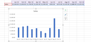
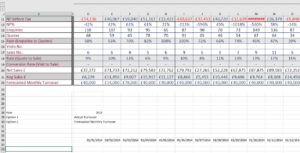
In this case, the chart is easy to produce because we only have one row of data covering just 10 months. However, what about if we had the data below :-
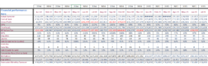
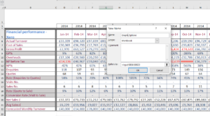
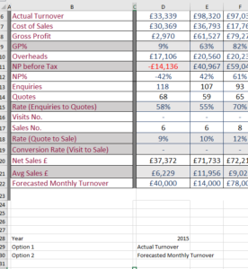
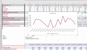
We have 17 rows of data and in fact the data goes up to 2019, so there are over 60 columns of data. The initial temptation might be to draw 17 graphs – which would probably result in either “Hell with Excel” or analysis paralysis.
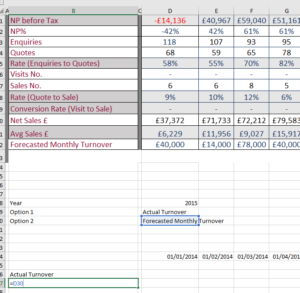
However, Excel offers another solution – dynamic charts – where you can select the data item (e.g actual turnover) from a dropdown, and the chart updates with the values from the relevant field:-
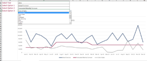
So In the chart above, the user can select up to three options and the chart will pull through the values automatically. This is another big advantage of dynamic charts – it is very easy to do adhoc comparisons of data.
In addition, the solution permits the user to select which year they want to view. Hence if we have several years of data, and only want to watch a snapshot, the user can select the relevant year from the dropdown. We have set it up so that the user can compare the selected year with the previous year.
How to create a dynamic chart
The key to creating a dynamic chart is the way that the data is set up. In particular it should be a single tranche as per the diagram above. One thing I would recommend is to extend the time period so that it includes say the next 3 years from the outset:-
This means that the person doing the data entry won’t have to come back to you each year to update the formulae.
There are three key stages in setting up a dynamic chart:-
- Creating the data entry area – where we specify the year and drop downs for the values.
- Setting up a mini data table – which uses the values from the drop downs to pull the data from the main tabl
- Set up the graphs using the values in the mini data table.These are explained in more detailed below.
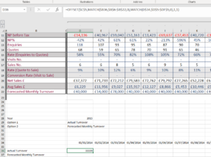
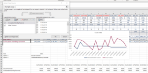
Step 1 – Creating the data entry area
In this stage, we set up the interface so that the user can specify the years and create the drop downs. Note for simplicity, we will keep everything on the same sheet.So in cells B28,B29 and B30 enter the values Year, Option 1 and Option 2 as per the screenshot below:-
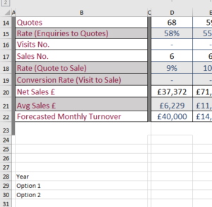
For simplicity, we just going to do a dynamic chart that allows the user to compare two values. However, it can easily be extended to have additional values.
The next step is to set up a couple of named ranges called “Graph_Options” and “Years” respectively:-
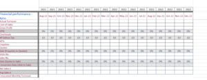
Named ranges can set up via the formulas option on the main menu. In this case,the named range consists of the values in the range B6:B22 – which are the possible options for the graphs.We also need to set up one for the years. In this case we need a blank area of the sheet – which the user won’t see (I often use a separate sheet) and type in the consecutive values for the years:-
Observe that we start the values for the year from 2015 rather than 2014,as in the dynamic chart we are comparing one year with a previous year. So when we select 2015, the previous year is 2014.
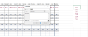
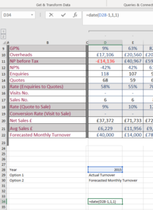
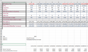
Now go back to the left hand side of the sheet, and use data validation to restrict the values that can be entered in cells D28 (for the year) and D29 & D30 for the graph options:-
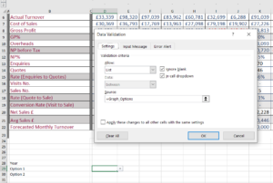
Then use the drop down to select the values. For now we will select the values 2015, Actual Turnover and Forecasted Monthly Turnover:-
That completes setting up the data entry part.
STAGE 2. Setting up a mini data table – which uses the values from the drop downs to pull the data from the main table.
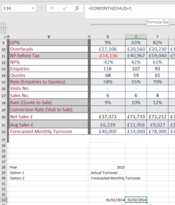
The first part of the data table is to create the monthly timeframe. Using the date function, we enter the formulae above in cell D34. This sets up a link to the 1st of January of the selected previous year. So if cell D28 has the value of 2015, then the formulae above gives the value 1/1/2014.
We now need the next 23 consecutive months in our formulae. Excel’s EOMONTH formulae can be used to specify the end of a month whose value is stored in another cell. So for example, if we have the date 23/04/2015 in cell C12 then putting the following formulae in D12:-
D12 = EOMonth(C12,0)
Will return the value 30/04/2015 – the end of the current month. And if we want the first of the next month we just add one:-
D12 = EOMonth(D12,0)+1
Which returns 1st May 2015. This is how we start to create the time line for the graph :-
And we now need to have a slightly different formulae in the adjacent twenty two cells to get the full time line for the dynamic chart:-
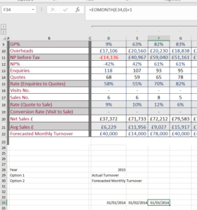
And now we drag this third formulae to the right to complete the time line – which should be 24 columns showing adjacent months. Altering the value in D28 will automatically adjust the values in the timeline.
The next step is to incorporate the two axis into the data table. These are just cell references to the values in cells B29 and B30. So in cells b36 and b37 put “=b29” and “=b30” respectively:-
The next step is the most challenging – populating the mini data table using the values from the axis and the timeline. It uses a combination of the OFFSET and MATCH functions to do this. The OFFSET function allows to return cell values relative to an “anchor” cell. The MATCH function returns the position of one value within another range.
Enter the following formulae in cell D36 – which will be the intersection of the first month and first axis option in the datatable:-
=OFFSET($C$5,MATCH($B36,$B$6:$B$22,0),MATCH(D$34,$D$5:$DF$5,0),1,1)
And now drag this formulae across both axis of the time line – to complete the values in the datatable:-
If you use the dropdowns in cells D28, D29 and D30 then the data table should update automatically.
- Set up the dynamic charts using the values in the mini data table.
This is the final part of creating the dynamic charts – actually creating the chart. Highlight the first row of the datatable and insert a standard line chart:-
This is the first axis in our graph. We can click on the graph, and select the data source to specify the second axis:-
Closing the pop up, we now have a dynamic chart – that allows us to select two rows from the main data table and compare.
Leave a Reply
Want to join the discussion?Feel free to contribute!